Uploaded image for project: 'GeoDashboard'
  1. GeoDashboard
  2. GEOD-1125

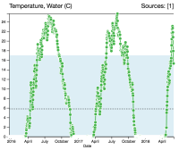
White circle on line graphs is confusing with lots of points close to each other

XMLWordPrintableJSON

    • Icon: Improvement Improvement
    • Resolution: Fixed
    • Icon: Normal Normal
    • 3.0
    • None
    • Dashboard

      The new line graphs have white borders around the points. This results in a lot of overlapping white when there is a lot of points that are close to each other. Maybe use a slightly darker green? or lighter?

      Also the size of the dot is a bit too big. Would it make sense to make it a bit smaller?

              indiragp Indira Gutierrez Polo
              lmarini Luigi Marini
              Votes:
              0 Vote for this issue
              Watchers:
              1 Start watching this issue

                Created:
                Updated:
                Resolved: