-
New Feature
-
Resolution: Fixed
-
 Major
Major
-
None
-
None
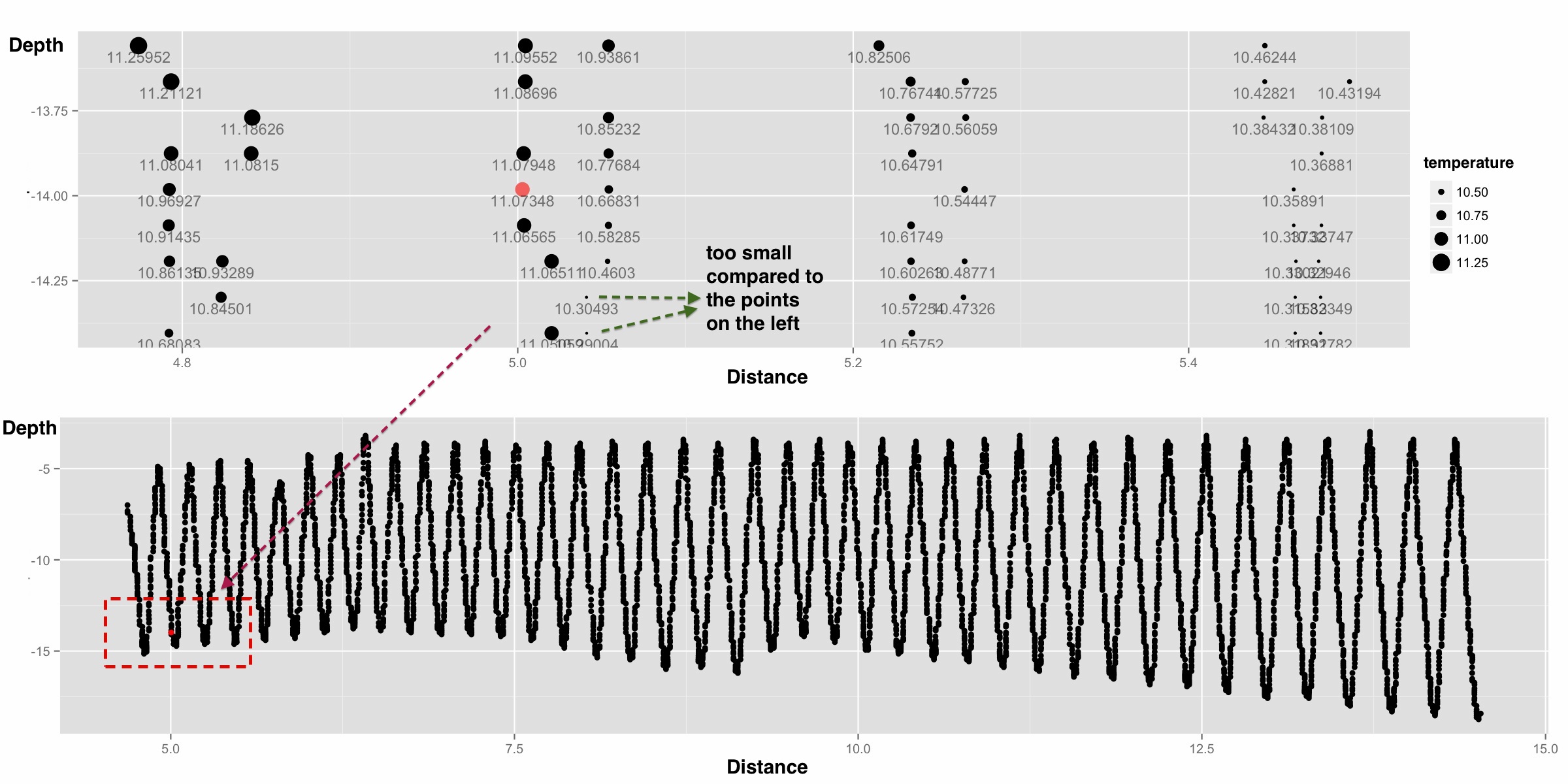
I looked at very detail level of temperature data and found something unusual. The plot shows the temperature values on Manitowoc2 path. The upper subplot is the detail level of the red box in the lower subplot. In the upper subplot, the size of points represents the value of temperature and the number below is the temperature value. From this subplot, there are some points that are too small compared to their neighbor points. I am not sure how to treat these situation