-
Improvement
-
Resolution: Fixed
-
 Major
Major
-
2.3
-
None
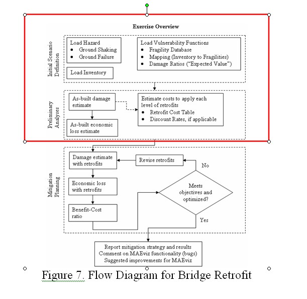
From Omar: I would complement the Analyses guide, in general, with the graphical visualization of how the analyses are chained together. Some figures could help tremendously to enhance the user's global vision of the program.
. A possible way to provide the potential of MAEViz and its usefulness is through flow diagrams like the shown in Figure 7 (it was taken from the tutorial). The objective of these diagrams is to provide a general view of the analysis and answer several questions that a novice user may ask, for example: what information do I need to retrofit bridges having a fixed budget? The diagram should show what data is required to conduct an analysis and, in the case of lack of data, it should also help the user indicating what he/she can do with the available information.
Each MAEViz analysis has its own diagram (per infrastructure system), which should display the utmost program potential; so, if a less complex analysis is required the same diagram can be used. For example, in the case of the bridge analysis example, if the user is only interested in damage assessment only the upper portion of the diagram is relevant (marked with the red rectangle).