-
Story
-
Resolution: Fixed
-
 Normal
-
None
-
None
-
None
-
SEAD 2.1 Sprint 1
We need to improve the user interface for the Matchmaker review, including making sure the link goes to the right place to address a particular item in the review and that the missing metadata warnings include metadata labels.
Acceptance Criteria:
(mockups are in progress and attached)
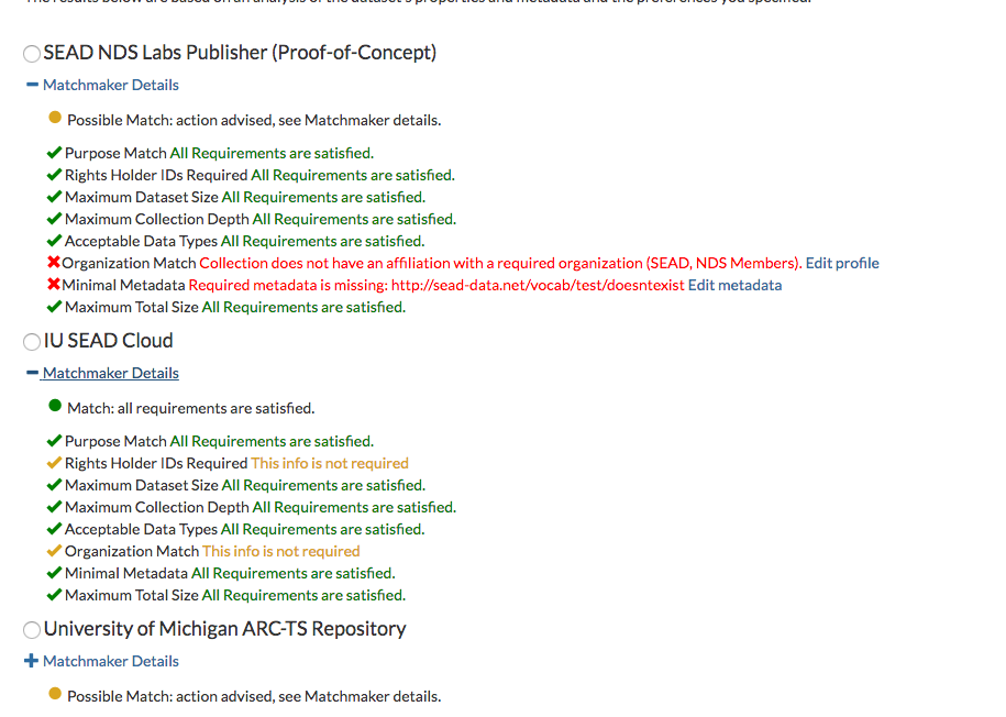
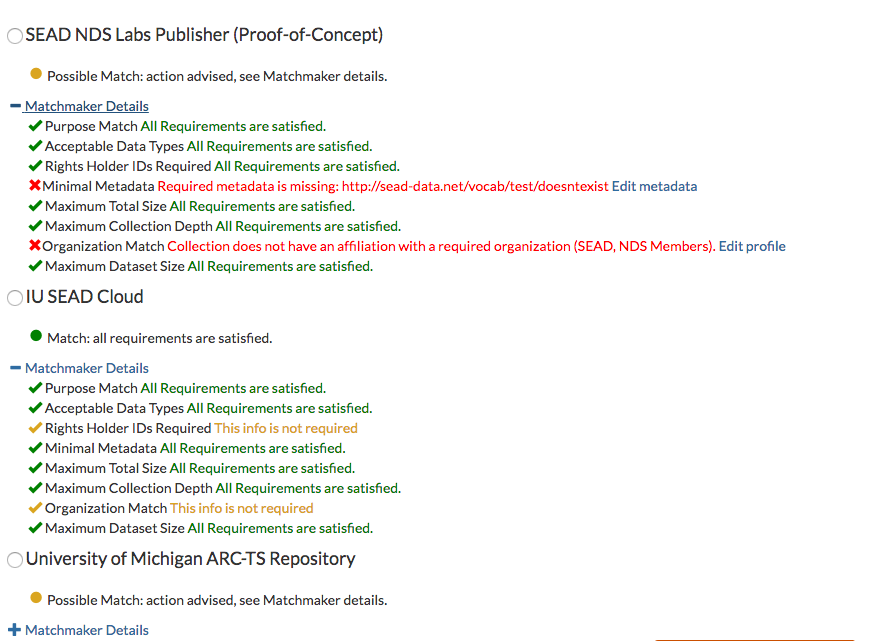
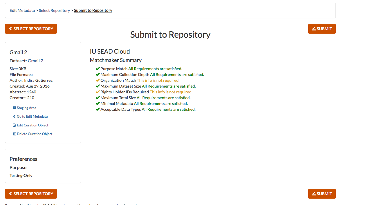
1. The review for each repository includes a summary message: we should have a summary message:
"Match: all requirements are satisfied."
or
"Possible Match: action advised, see Matchmaker details."
2. By default the detail view is hidden; users can click to see detail view for each repository.
3. Each item in the detail view that is satisfied will have a green checkmark. Each item in the detail view that's not required will have a yellow checkmark and message indicated that it's not required. Each item in the detail view that is not satisfied will describe the violation and present a link to the place the user would need to go to fix it. (NOTE: there are instances right now where the link does NOT take the user to the right place to fix the issue anyao knows about these places)
- mentioned in
-
Page Loading...


