-
Improvement
-
Resolution: Fixed
-
 Normal
-
None
-
None
-
None
In our user interface, we need to figure out the best way to integrate SEAD branding with project/center level branding. Find out where project level branding should occur and generate mockups for implementing project branding while still maintaining some SEAD branding. zhuxuan
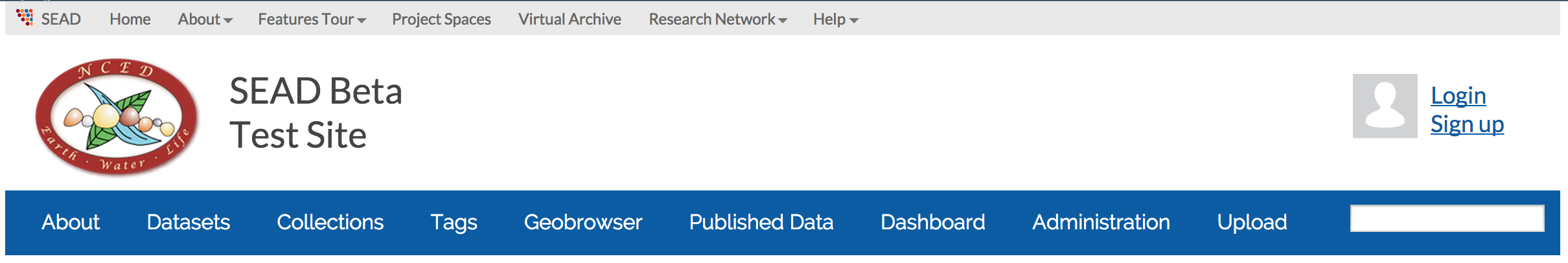
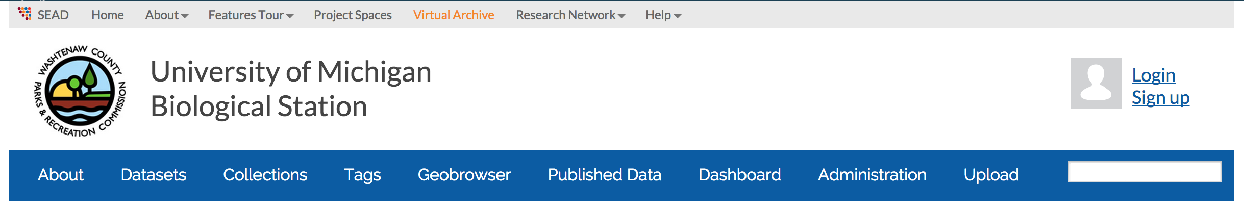
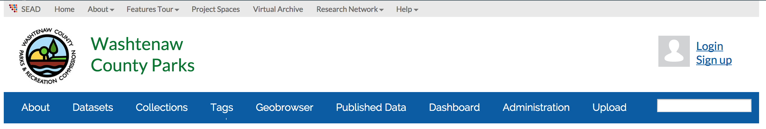
These mockups address integration of SEAD and project level branding, integrated navigation, and consistent look and feel with sead-data.net.
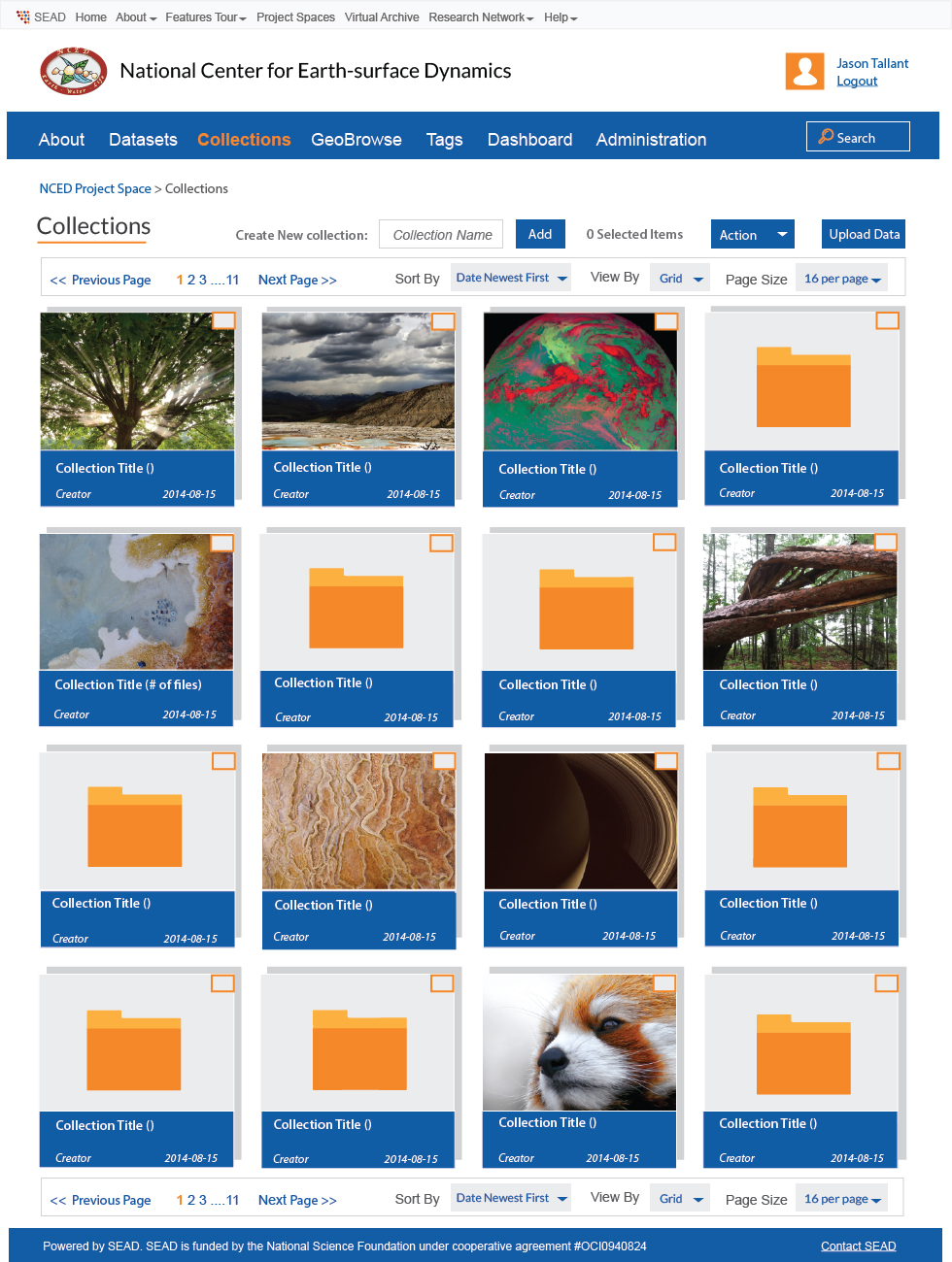
Collection & Datasets Pages Specs
Typesetting Changes
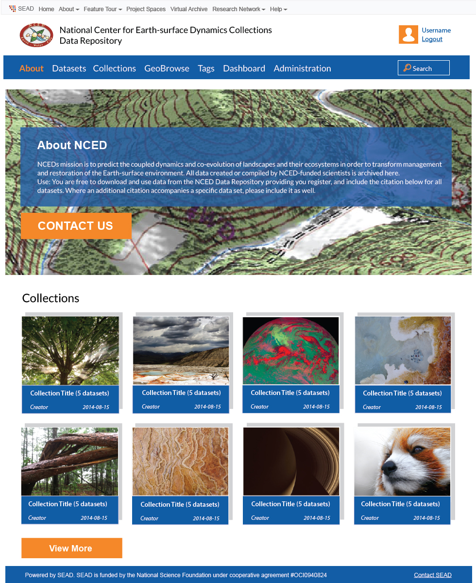
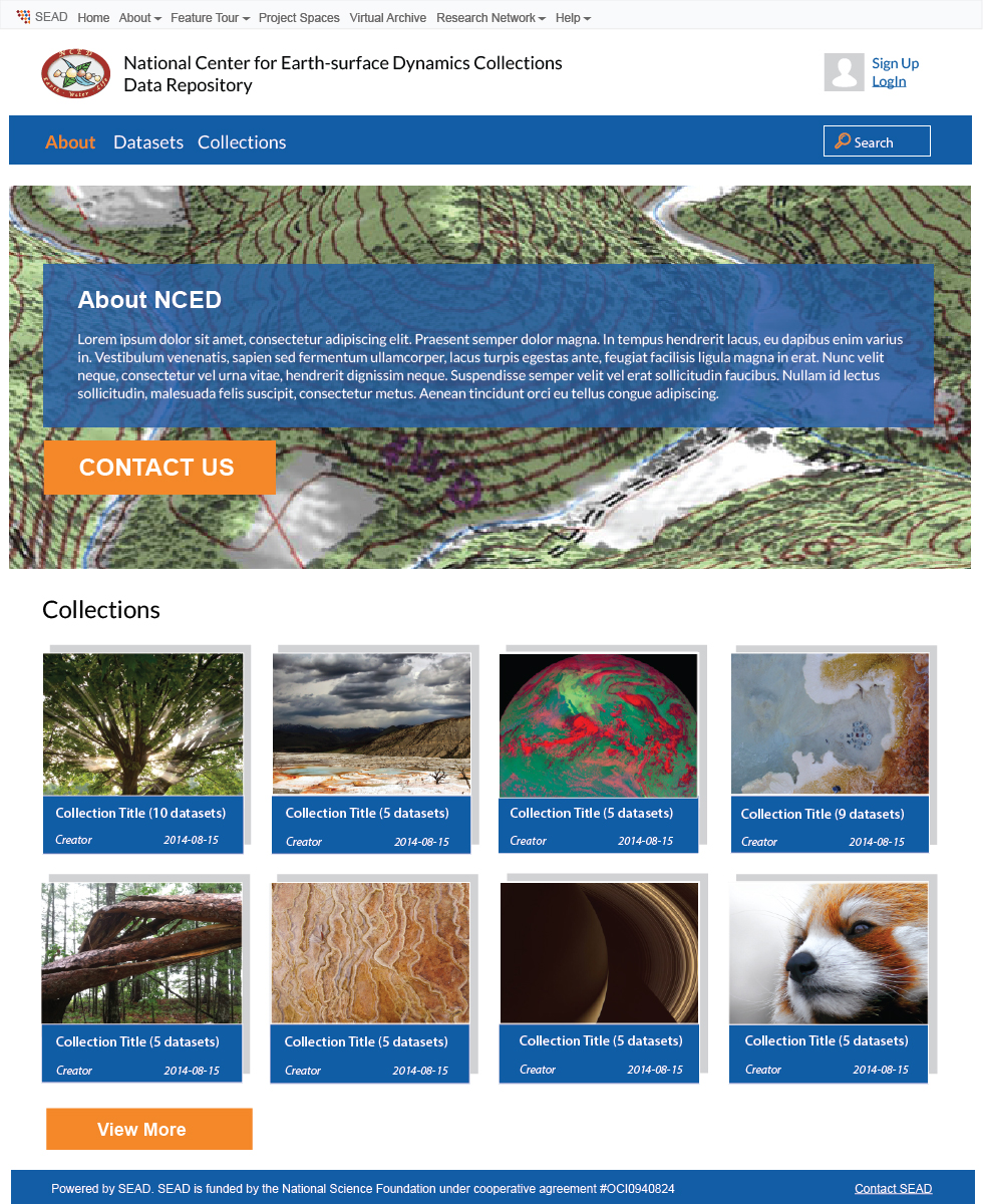
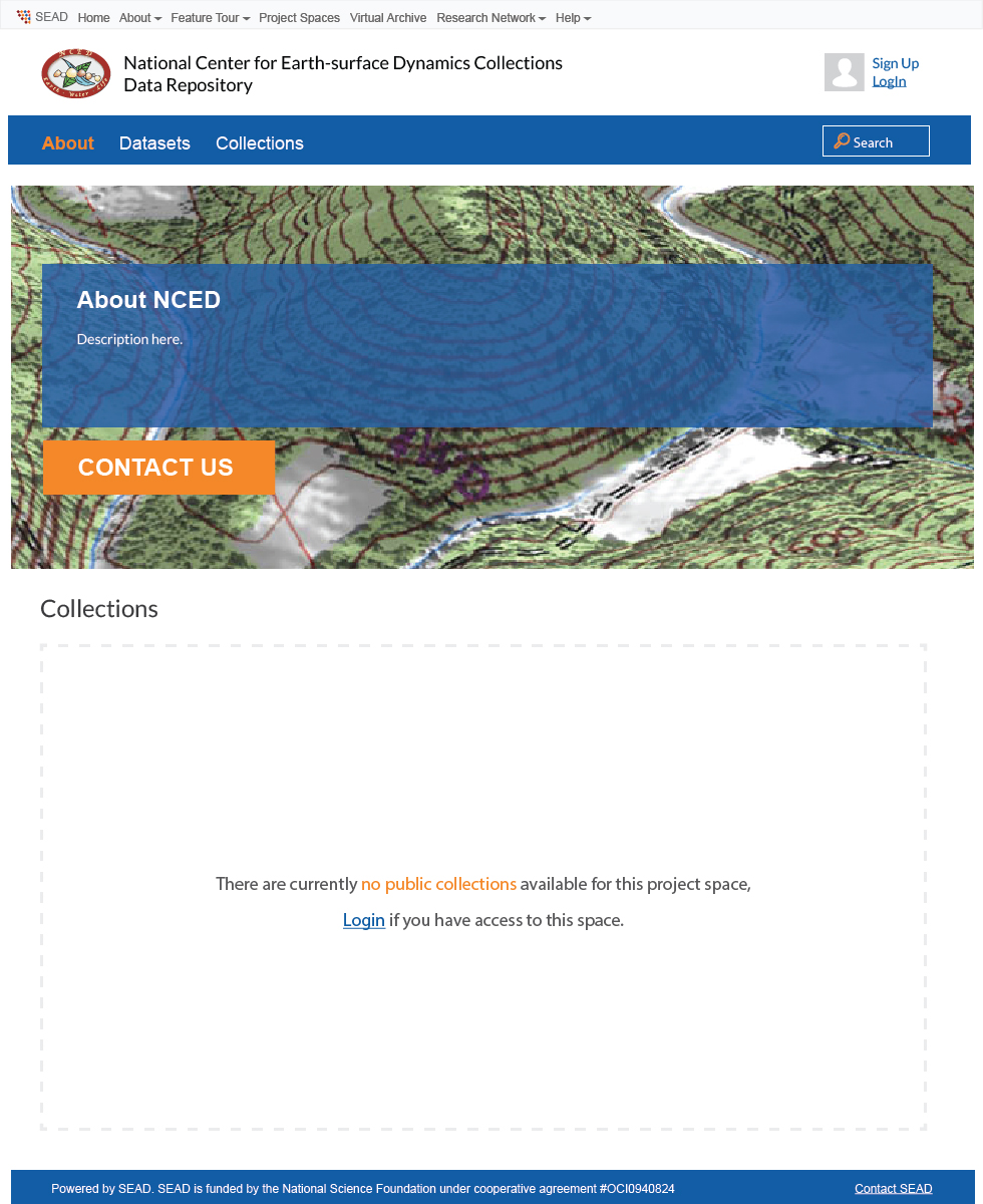
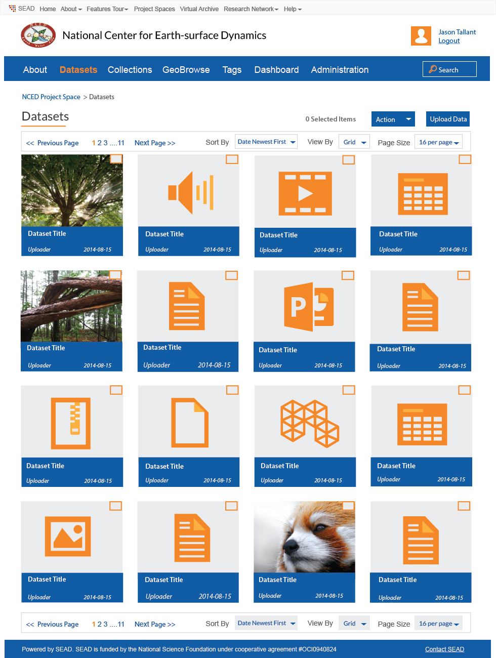
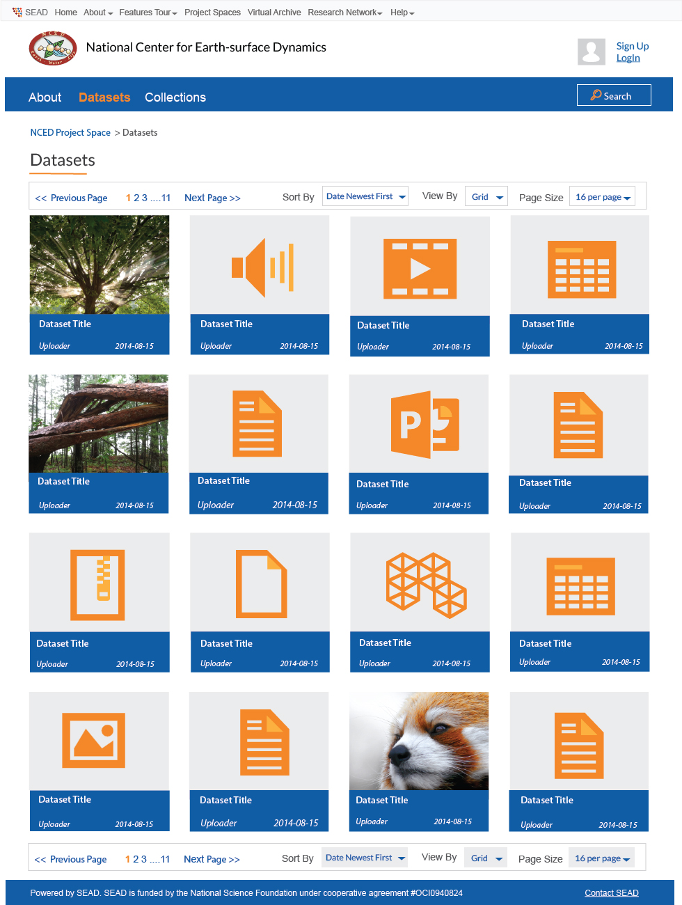
1. The landing page will be the "about page" when user clicks through. Attached mockups show how the pages look like when people visit it as a non logged-in user and as a logged-in user. Also, the mockups show how the page looks like when there are public collections as well as when the page has no collections.
2. Sub navigation has been added to the very top of the page for users to go back to SEAD website and explore other SEAD features
3. The logo of the project organization has been displayed at the header part of the page
4. The user login are displayed at the right top of the header
5. When logged in, the navigation bar will display “About”, “Datasets”, “Collections”, “GeoBrowse”, “Tags”, “Dashboard”.
6. When administrator is logged in, an “administration” is added to the navigation bar
Design Changes
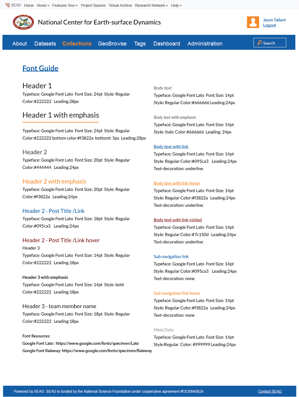
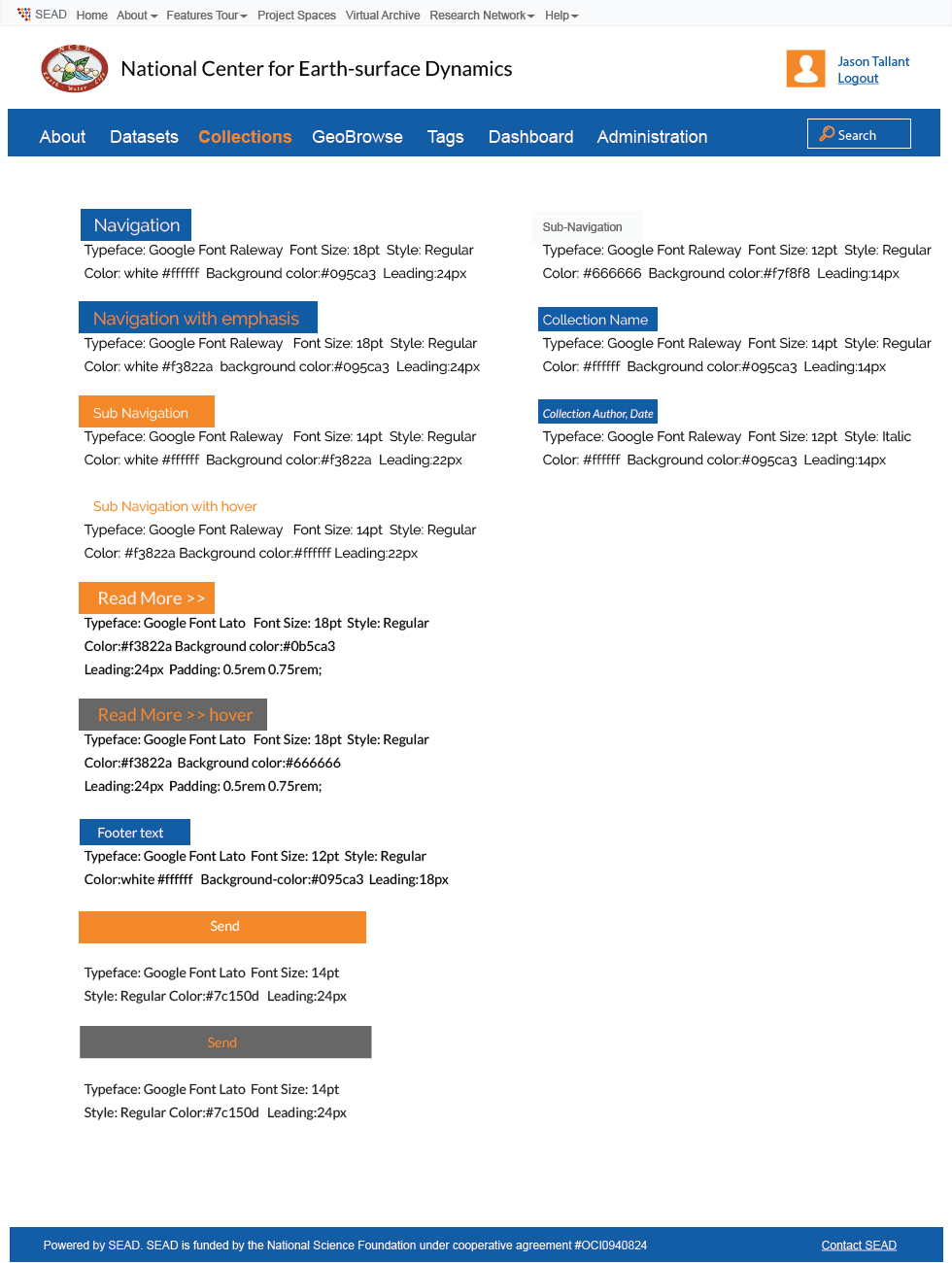
1. Font style can be found with font style guide
2. Header navigation bar height: 30 px
3. Logo max size: 540px(width) X 50px (height)
4. Collection image size: 200px X 200px
5. When collection name gets longer, it will automatically become two rows, see example in the mockups as “Long Collection Title that wraps to two lines”